|
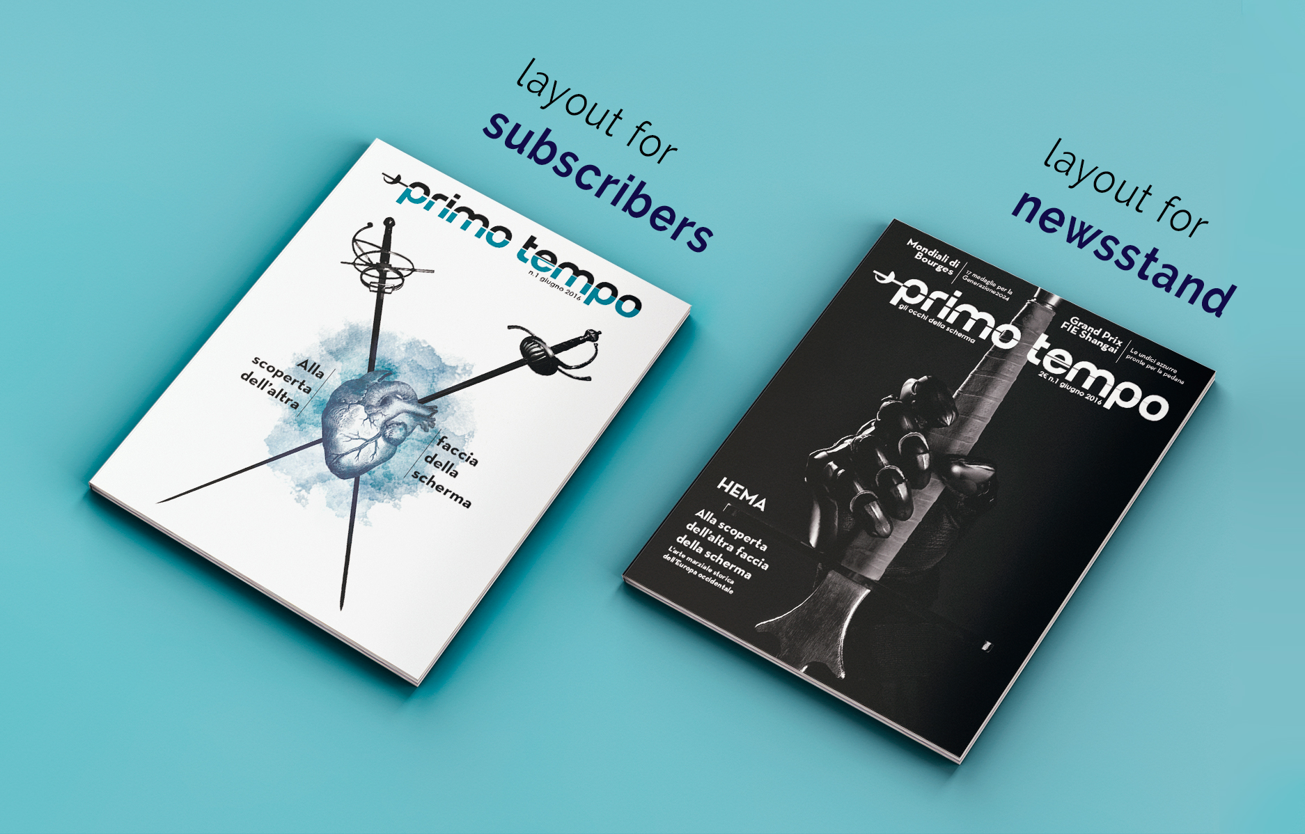
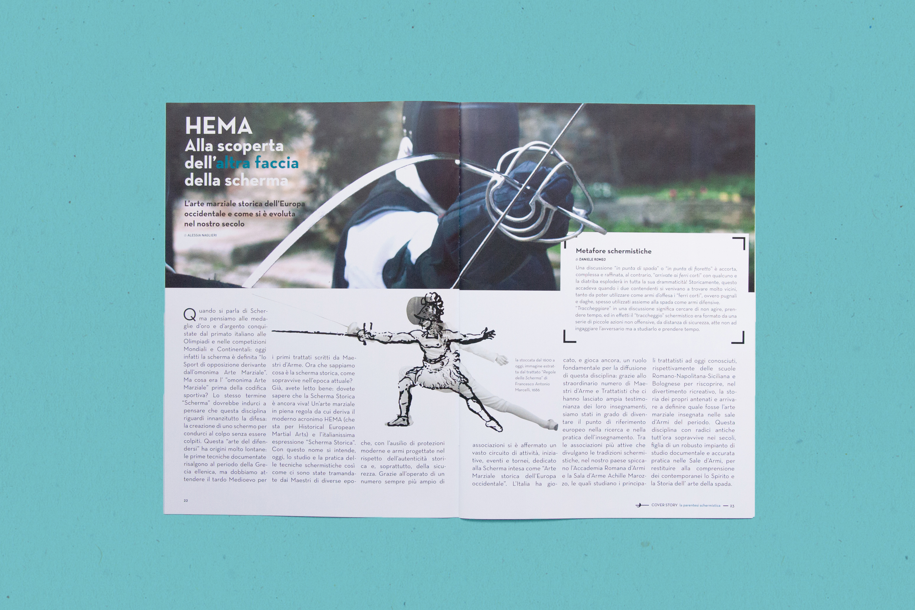
Fencing magazine for sport-lovers I have designed this magazine and logotype to be modern and fresh. This is a fencing magazine with a cover story talking about historical fencing. The two covers above show the two target audience at which they are intended. I’ve opted for an illustrated cover resembling a herald for the subscribers cover. Meanwhile, the newstand version has an engaging and powerful photography representing a black glove with a longsword. The grid for the article is composed of three columns. The illustrations are built upon, creating a neat and balanced space. |
|
|
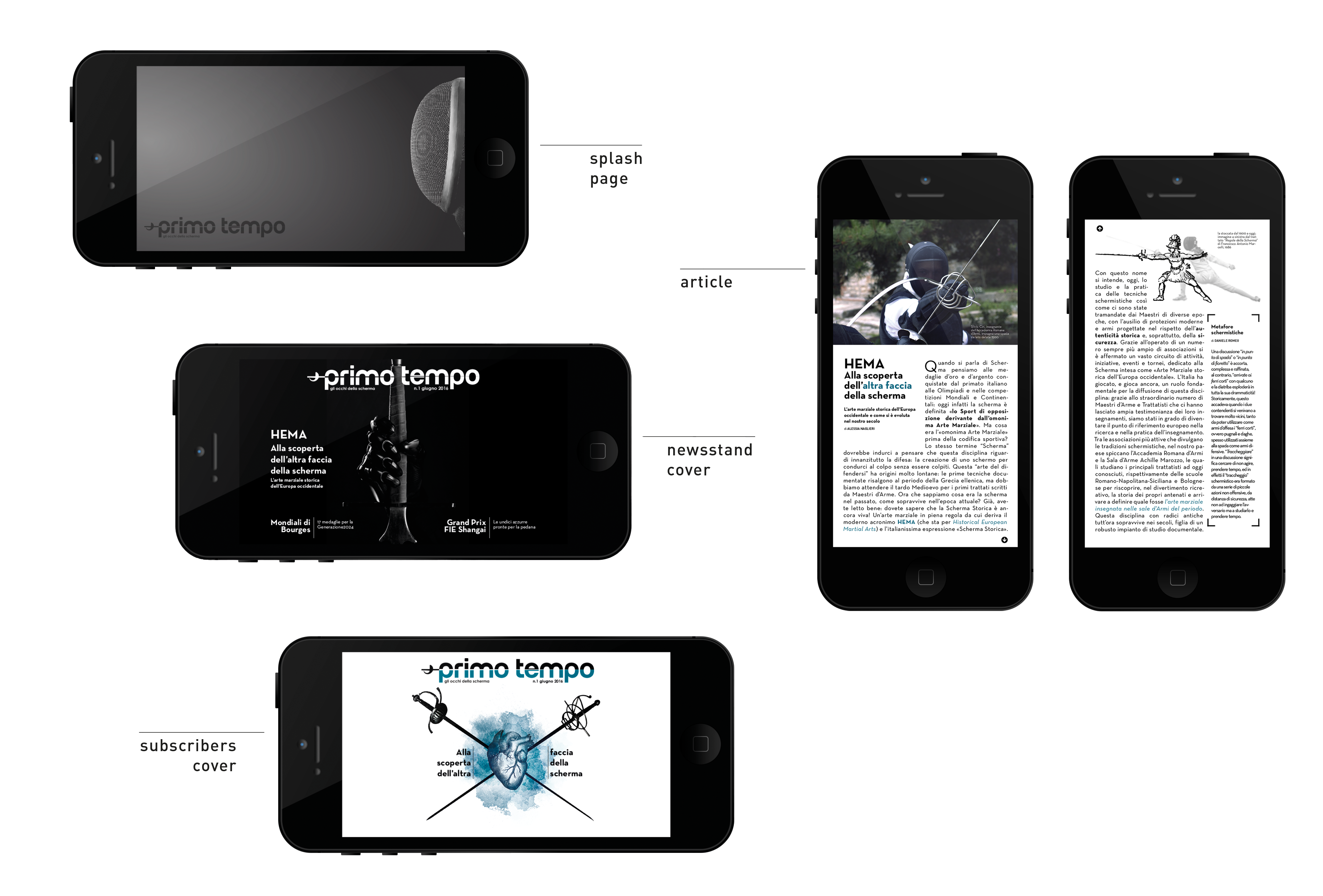
Logo adaptation for mobile devices This is a mockup of the icon for this magazine in the Apple store, both for tablet and smartphones. |
|
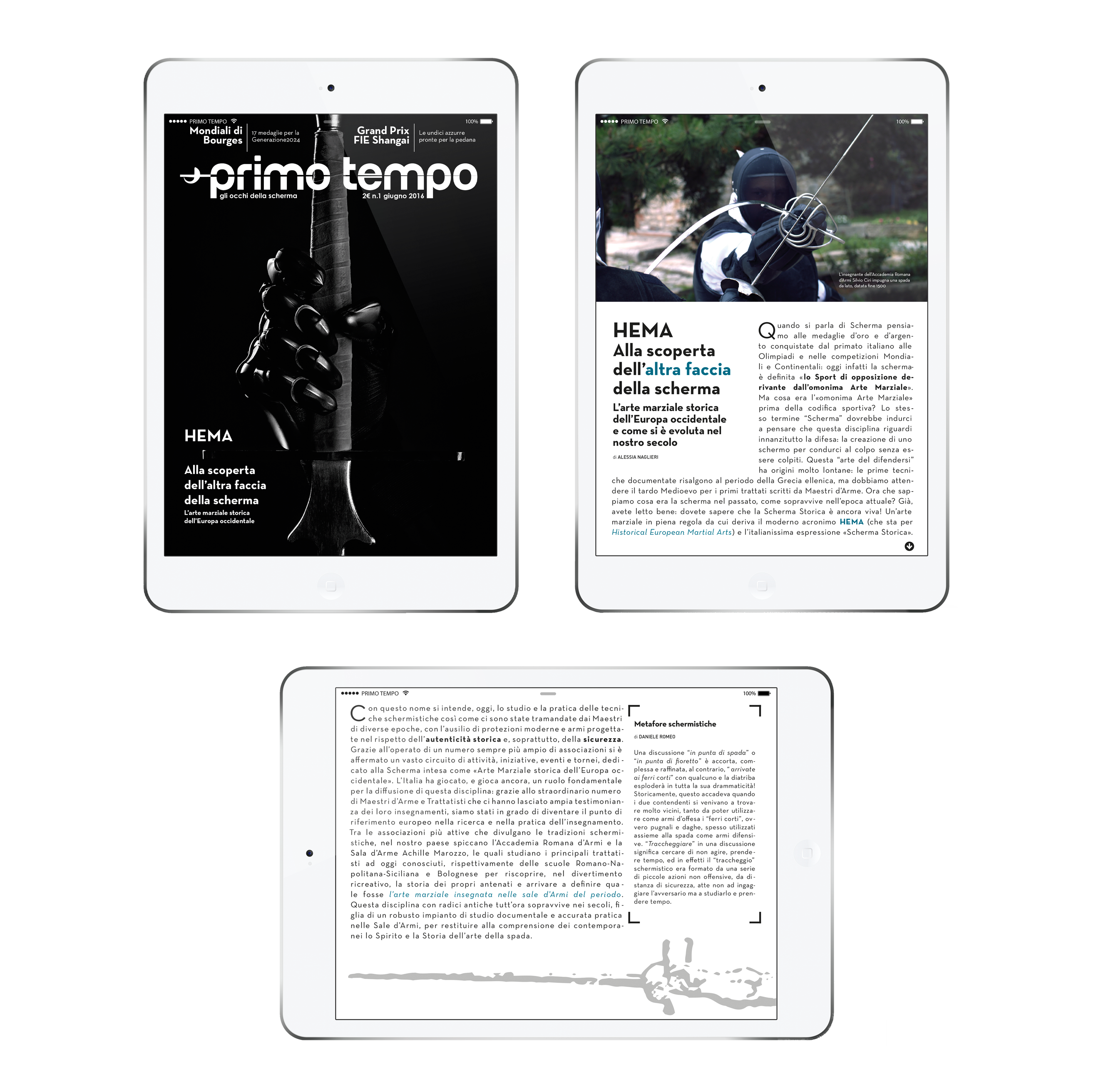
UI multiplatform adaptation Designing the visuals for the magazine app in iOS, I had to take into account space, hierarchy and legibility for a smaller viewport. I have opted for a three column vertical grid and adapted covers, article and splash-page for both landscape and portrait. |
|
Magazine design and UI
Fencing magazine for sport-lovers
I have designed this magazine and logotype to be modern and fresh. This is a fencing magazine with a cover story talking about historical fencing. The two covers above show the two target audience at which they are intended. I’ve opted for an illustrated cover resembling a herald for the subscribers cover. Meanwhile, the newstand version has an engaging and powerful photography representing a black glove with a longsword. The grid for the article is composed of three columns. The illustrations are built upon, creating a neat and balanced space.
Logo adaptation for mobile devices
This is a mockup of the icon for this magazine in the Apple store, both for tablet and smartphones.
UI multiplatform adaptation
Designing the visuals for the magazine app in iOS, I had to take into account space, hierarchy and legibility for a smaller viewport. I have opted for a three column vertical grid and adapted covers, article and splash-page for both landscape and portrait.